Solar 2 Review
Solar 2 Review
Solar 2 is an indie game by Jay Watts where the you control a celestial body through the massive void of space, colliding and absorbing other smaller objects in order to get bigger.
Simple enough, right? The game is like Flow meets Spore meets basic physics. Your key objective is to make it through the life cycle of a planet/star while avoiding larger objects or black holes.
Graphics/Sound/Performance
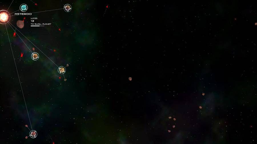
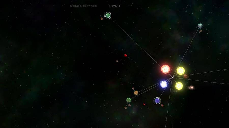
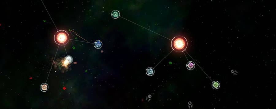
Graphics are dead simple. It’s a star map with objects. There’s also an ambient music track to help contain the mood. No problems here. Nothing demanding either. It’s all 2D. My Moto G and Nexus 4 had no hiccups playing it.
Despite an epic amount dire simplicity, there are missions and challenges. The objectives range from absorbing, protecting, growing, or destroying things. Some dialog is mixed in there (but hard to see) at the bottom of the screen during missions. Dare I say everything is gravitationally centered around the core gameplay? I found myself lost in the game for an hour without realizing it, largely ignoring the challenges, and playing in the sandbox.
Gameplay/Controls:
Flying near a smaller planet locks it in orbit. From there, you can either let it thrive or absorb it. As you get bigger, the number of planets you can hold in orbit increases. Don’t get too big otherwise, you’ll create a blackhole. There are other systems you can try to steal planets from or little enemy marauders that will try to squander a bits of your progress. The game generously will let you at different stages of your planet/sun development so you don’t have to go back to square one again.


- 1
- 2
- 3
Controls are okay. The object you are controlling is always centered. It’s enough to not get it mixed up with similar objects. Touching an area of the screen around your object will move it in that direction. There’s a sense of speed relative to other objects. The touch gestures for absorbing planets are hit or miss. Some of the more delicate maneuvers can’t be as well executed either. The saving grace here is overlay controls. It enables directional pad and action buttons on the screen. While my thumbs covered about ⅓ the screen in either control style, the game is still very playable. Tablet users probably won’t find this much of a problem. Where’s the tilt controls? Regardless, controls are not perfect but it works nonetheless.
Conclusion
The game is designed to burn time (and space). It’s simple, has some depth, and isn’t terribly long depending on your play style. It’s easier to fault it for negatives like the controls or tiny touch interface (particularly in the menu). It’s a nice mobile game but feels much better on a PC with keyboard and mouse controls.
Positives
- Open, endless gameplay
- Charming dialog within the context
- Ambient track captures the mood
Negatives
- Text is very difficult to see at times
- Touch controls are a little stubborn


