Mythic Mischief Components Overview and Unboxing
We have said it many times before, and we will say it again – IV Studio makes fantastic games, and regardless of whether or not you enjoy the gameplay, there is no denying that the games themselves are beautifully produced, if not over produced in some situations. Let’s take a look at one of their earlier titles, Mythic Mischief!
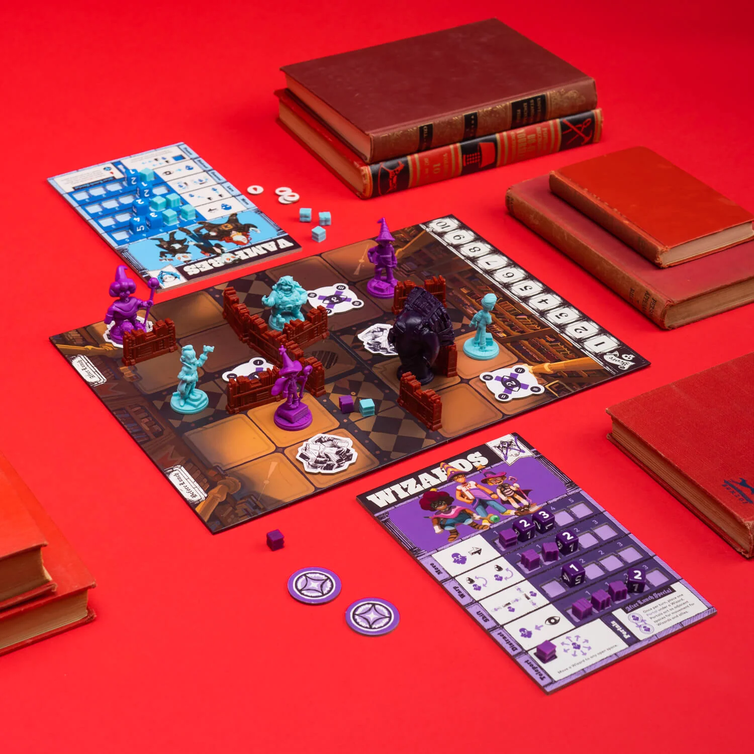 In Mythic Mischief, players will use their three Mythics to move around the board, attempting to avoid the Tomb keeper while forcing their opponents directly into the path of the Tomb keeper to earn points. Within the box, each player color – 4 included in the box, plus a wackload of expansions – has its own dedicated game tray which holds their player pieces, book cubes, and special tokens.
These players insert nicely nestled into the box stacked on top of each other – the remainder of the box has dedicated spaces for the Tomb keeper miniature, bookshelves, and the various tokens you will be laying out on the board. The individual player boards, as well as the main board itself fold in half and lay on top of all the pieces.
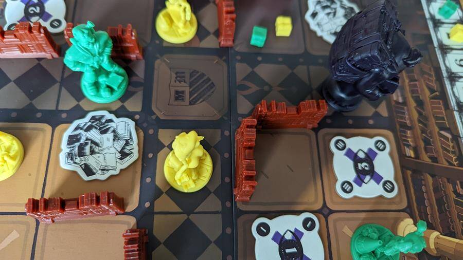
The miniatures are very detailed and made of hard plastic. I have no concerns about any of these miniatures breaking or chipping – the quality is very, very good. The Tomb keeper and the bookshelves are made of a similar quality. When you think that everything in this game COULD be just tokens, it’s nice to see so much detail and care put into making this look fantastic on the table.
The punch board tokens were easy to punch and feel really good to use. There are only a few tokens in play with this game, but they are more than adequate.
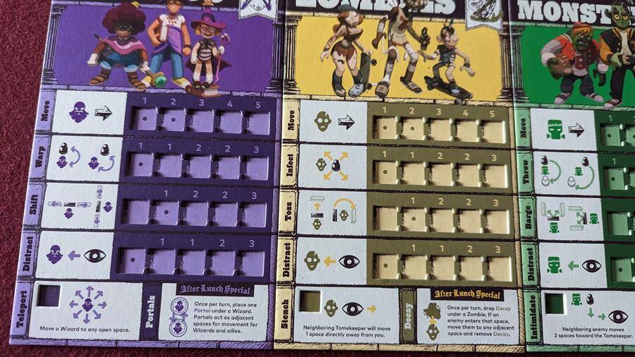
The player boards are fantastically detailed with images to depict the various actions you can take, as well as dual layered spaces to place cubes during the game. I think dual layer boards should be the norm in board games moving forward, but as it is not yet, this is a nice addition from IV Studio.
The overall aesthetic of the game is amazing, and really fits the school theme the designers are going for here. The artwork, when necessary (mostly on the game board) is phenomenal, and the art on tokens and boards fits the look of the miniatures. So often we review games where the board and card art doesn’t match the miniatures included in the box, but that isn’t the case here. Again, extra care and attention from IV Studio goes a long way in making these look great!
Overall, as with all IV Studio titles, I’m really impressed with the look and feel of this game. It’s a game that, when on the table, encourages people to stop and watch. While a good looking game doesn’t necessarily make a game good, it goes a long way in making the play experience more enjoyable.
Article By Adam Roffel
 Adam Roffel has only been writing about video games for a short time, but has honed his skills completing a Master's Degree. He loves Nintendo, and almost anything they have released...even Tomodachi Life.
Follow Adam Roffel on:
Twitter: @AdamRoffel