New PS4 OS Screens Underwhelm Some Fans
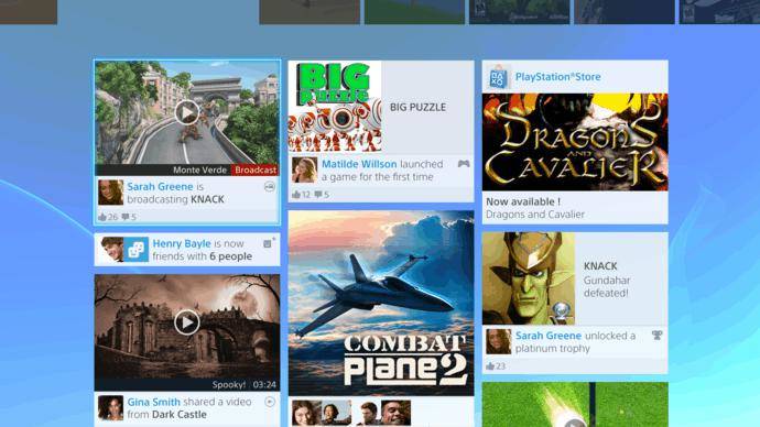
The new set of PlayStation 4 OS screens snuck out very quietly via Flickr, so quietly it took a short while for pictures to begin to show up in the press. Now with a little over two days spent picking them apart, the verdict is in: the new operating system is disappointing to some, and a lot of people seem unhappy.
Across a number of communities, including Neogaf and Reddit, users are looking over the pictures and finding things that they really don’t like.
Most commonly mentioned is the over-reliance on social features with the PS4 OS. That every single thing you do is available to be liked and commented upon might add a new element to gameplay for many of us, but others are worried that “likes” might take over actual discourse, and that this will render the whole thing worthless. Another user, Dark FaZe, pointed out that, in light of the PSN downtime of 2011, he couldn’t believe they were pushing for their users to pass over even more private data.
It isn’t just the social stuff though. The general design of the PS4 OS has made some disappointed as well. Called “haphazard” and “without thought,” the size and shape of the boxes offer a stark contrast to the current XMB, where everything occupies roughly the same amount of space.
Defenders pointed out that many operating systems and services use a similar layout – citing Windows 8, Netflix and Myspace, amongst others – but that didn’t seem to sway the detractors.
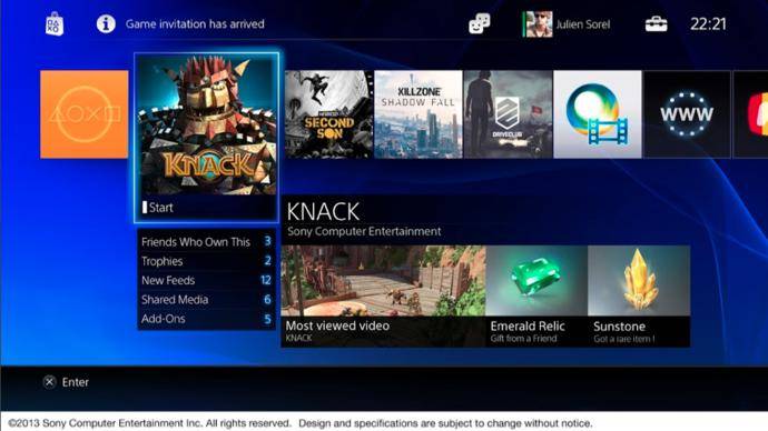
Even the already revealed home screen came under fire.
If that is the homescreen, people complaining about the lack of hierarchy and sorting options in the XMB and praising this better really think their position, that would be a terrible homescreen. Just one long horizontal scroll for everything? No thanks.
It doesn’t seem that the opposition have it any better, with many worried that ads might end up taking prime place on Xbox One.


